“Juxtaposed pictorial and other images in deliberate sequence, intended to convey information…”
This is an amazing definition of Data Visualization!
In the practice of Data Viz we take images in the form of charts, graphs, and text, and position them in a logical pattern to provide additional information and context with each subsequent piece.
The above quote is by Scott McCloud in his book “Understanding Comics: The Invisible Art”
McCloud, himself a comic book writer and artist, wrote this 1993 classic in a time when the American comic book had skewed away from cowboys, capes, and masked mystery men and was in the midst of a wave of angsty anti-heroes covered in pouches who shot first and asked questions later.
But the book isn’t about WHAT comics are about. It’s about HOW comics function, and it turns out comics have a whole lot in common with Data Viz.
The book begins with a history of visual literacy, tracing the roots back thousands of years to 1300 BC and before. While we, as modern Data Viz practitioners work in a new format, we aren’t truly working a new medium. We just use different chisels and paintbrushes than our forebearers.
If you’ve been in the Data Viz game for a couple of years you’ve probably put a lot of thought into the art and science behind what makes a good viz work. Preattentive attributes like color, size, position, shape are used appropriately. The juxtaposition of pieces of data. The correct level of detail to represent a larger idea without overwhelming.
There are a million ideas in the book that we can learn from (and maybe I’ll write future pieces on this) but I think it’s important to begin with this one.
CLOSURE
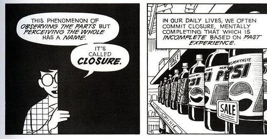
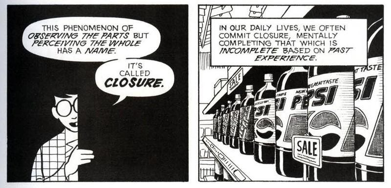
Look at the two panels above and tell me what you see?
The leftmost panel shows a drawing of a man speaking and the rightmost shows a grocery store shelf stocked with 2 liter bottles of Pepsi.
How did you know that?
That’s not ACTUALLY what’s in those panels!
The first shows a partial drawing of a person. Half of his body is cut off, in shadow (but actually never really rendered by the artist).
The second panel shows a shelf of bottles, but not a single bottle fully shows the word “Pepsi”.
YOU filled in the gaps.
Closure is the concept that the reader closes the narrative gap in an image or images. They’re not a passive participant, but an active creator in YOUR WORK.
It’s a bit terrifying, right?
In any work you create, you end up relinquishing a portion of control, no matter how much you’d like to think otherwise. Your audience is going to bring to the table their experience, level of knowledge, and biases.
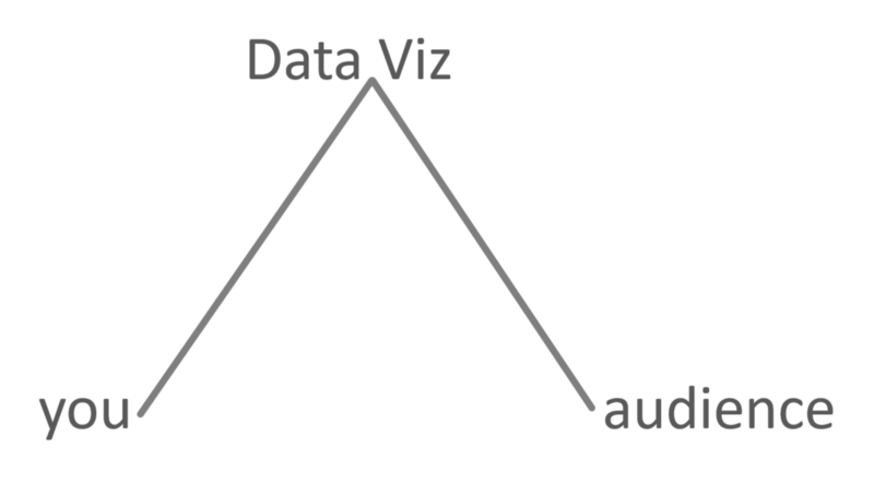
One of the limiting factors of your work is that you can’t speak directly to the audience. Your Data Viz is your conduit to them. So understanding and using closure to your advantage is paramount, since you can’t be there in person to present your work every time it’s seen.
It’s a limitation that you can’t hold everyone’s hand and communicate with them directly, that the Data Viz is your voice, but it’s also freeing.
You have a collaborator!
What this means is, the better you understand your audience, your silent accomplice, the better you’re able to knit together your visuals to lead them to the data stories you’re trying to tell.
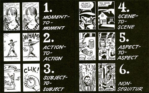
Let’s look at another example from McCloud’s book. Previously, we as the audience used closure on a single image to fill in absent details. What if we connect two images?

Ok, grizzly example, but you get the idea. We see the first image (AND text) of a man being chased by an ax-wielding maniac. The next picture pulls back, giving us context to where it is happening as well as a blood-curdling scream to fill in what happened.
On their own, each of these visuals tells a portion of a story, but when read together they add up to more because we gain context and are able to apply closure to extrapolate meaning both from details present as well as the application of our own life experiences with genre fiction.
Think about what McCloud DIDN’T have to show also to tell the story.
We don’t see the axe swing. We don’t see the blade strike. But we know the outcome.
Imagine you’re asked to assemble a dashboard that focuses on US profit ratios by state for the lower 48.
What kinds of things do we need to tell our audience and what do we not need to say?
We probably don’t have to say there’s 50 states. In fact, we may not even need to show or describe every state.
Are we being asked to compare states geographically? If not, we likely don’t need to see a map right?
Understanding that our audience doesn’t need geography changes our approach to storytelling, allowing us to skip the need to explain the relationships between states on a map.
Maybe bars would be better?
Do they really need to see EVERY state, or maybe just the best and worst?
After all, they KNOW there’s 50. You didn’t need to tell them that.
Well, now that we have a more manageable amount of visual information, do the bars even need colored? After all…they can see the length, right? What is the color depth adding here?
Much of what I’m highlighting here is likely something you’re already familiar with. Paring down a visual to the most important parts needed to explain the underlying message.
I’m attempting to give you a name, a context for it. Leveraging what your audience already knows to tell a better story.
Take a look at some examples of Closure and think about how one chart can provide context to another.
An establishing shot of your dashboard (highest level), that leads to context to that detail (intermediate level), and ultimately a more granular view providing ground-level insight (lowest level).
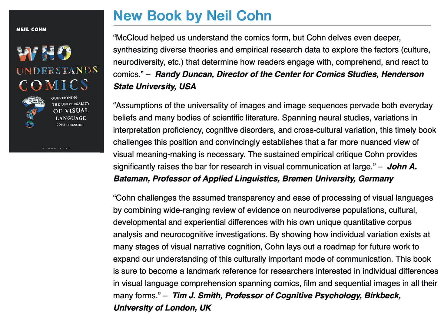
Now, I’m no scientist. In fact, Neil Cohn Ph.D. of Tilburg University (@visual_linguist on Twitter) debates the concept of McCloudian Closure in his book “Who Understands Comics: Questioning the Universality of Visual Language Comprehension”
I’ve invited Dr. Cohn to read this piece and provide feedback, so expect me to write a follow-up. Additionally, keep your ear to the ground as we’re currently working on a conversation for the Data + Love Podcast.
